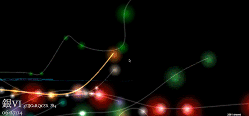
At the personal level, your daily commute might seem tedious, even mind-numbing. But on a macroscopic scale, public transit generates a whole lot of data that can become beautiful when put into the right hands. Case in point, Japanese web developer Null Design takes data from the Tokyo Metro and transforms it into a gorgeous 3D universe of colorful pathways, glowing orbs, and a spacey journey into the aether with Metrogram3d.
Advertisement
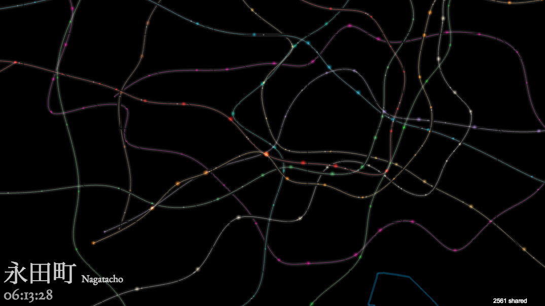
In the WebGL experience, viewers can follow individual trains in real time, represented in lines that look like light paintings. While it offers a small note at the bottom that names each metro line on-screen, it's otherwise abstract—more an eye-pleasing visualization than a useable map—but a fertile example of the creativy possibilities for the intersection between urban living and the infrastructures that enable it.For a visual experience that's still beautiful, but a bit more relatable to everyday maps, try the precursor to Metrogram3d, which is just called Metrogram. And for a sonic tour of a New York City subway line, check out Two Trains.
ONE EMAIL. ONE STORY. EVERY WEEK. SIGN UP FOR THE VICE NEWSLETTER.
By signing up, you agree to the Terms of Use and Privacy Policy & to receive electronic communications from Vice Media Group, which may include marketing promotions, advertisements and sponsored content.