When Comedy Central first asked designer Mike Perry to work on Broad City, he said no. To be fair, Ilana Glazer and Abbi Jacobson's web series-turned-TV sensation was then largely unknown. Perry, who previously designed collaborative coloring books, Hawaiian shirts, and a sculpture of Batman vomiting paint, was overbooked and unable to take on the task of designing the 7-second-long intro. When they offered him the gig again a month later, his schedule had cleared up and he took the leap: “I feel crazy that I said no at first. What’s wrong with me?” he laughs. “I’m very grateful that the universe was open and was like ‘It’s all good. You should come back to Broad City.'”
The design brief from Comedy Central was simple: they wanted bold and colorful hand-drawn animations and a visual identity that exuded the same level of comedy and weirdness as the show. For the first meeting, Perry ideated and conceptualized pencil sketches of how they could play around with type. The Comedy Central team, including Glazer and Jacobson, decided they wanted to use all of them, evolving and refreshing the intro with every episode, as if it were a vital character in the show.
Image via“The power of animation is that you’re not bound by the laws of physics. You don’t have to make something that exists with gravity and weights," he says. “You’re allowed to do anything, and the only limitations are what I’m able to concept.” This is what sets his work for Broad City apart from his illustrations, sculptures and other design work he’s created in the past— “Anything that moves, you have the abstract element of time.”
ONE EMAIL. ONE STORY. EVERY WEEK. SIGN UP FOR THE VICE NEWSLETTER.
By signing up, you agree to the Terms of Use and Privacy Policy & to receive electronic communications from Vice Media Group, which may include marketing promotions, advertisements and sponsored content.

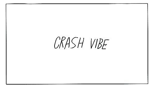 Sketch of 'Crash Vibe.' Broad City ©2015 Comedy Partners. All Rights Reserved. Comedy Central, Broad City and all related titles and logos are trademarks of ComedyPartners.Perry tackles the animations by first narrowing down an idea to its most basic form or action. For one intro, for example, he was inspired by the concept of a pimple as typography. “If this is going to be about a pimple, I’m going to want it to pop, and the pop would have to be intense. That’s the overarching story of this piece.” He’s also experimented with a “walking the apple” motif—”I have no idea why I called it that. That’s kind of how it started in my head.”— the colors of the American flag, as requested by Jacobson and Glazer, and the motion of an elevator for Broad City.
 Image via“The power of animation is that you’re not bound by the laws of physics. You don’t have to make something that exists with gravity and weights," he says. “You’re allowed to do anything, and the only limitations are what I’m able to concept.” This is what sets his work for Broad City apart from his illustrations, sculptures and other design work he’s created in the past— “Anything that moves, you have the abstract element of time.”

 Related:The 8 Best Artist Recreations Of The Simpsons' Intro Couch GagHow They Did It: Marco Polo's Ink-Drawn Title Sequence Inside Chad Vangaalen's Cosmic Music Video for Shabazz PalacesWatch A Cerebral Animation Illustrated With Ink, Coffee, And Whiteout